Navigation arrows help users manually cycle through your slides and are often a core part of the slider’s design. Sliderberg lets you customize these arrows directly in the block settings—from shape and size to color and position.
This guide walks you through each setting, allowing you to style the arrows to match your layout.
Step 1: Select the Sliderberg Slider Block #
Click inside your slider until the full Sliderberg Slider block is selected.

Step 2: Locate Navigation Settings #
With the slider selected, check the right-hand Block settings panel and locate the Navigation Settings.

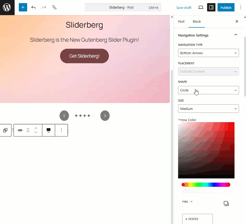
Step 3: Customize Navigation Arrows #
Here, you can change the Navigation type to Split Arrows, Top Arrows, or Bottom Arrows.

The Placement option is available only for the “Navigation Type: Split Arrows” option.
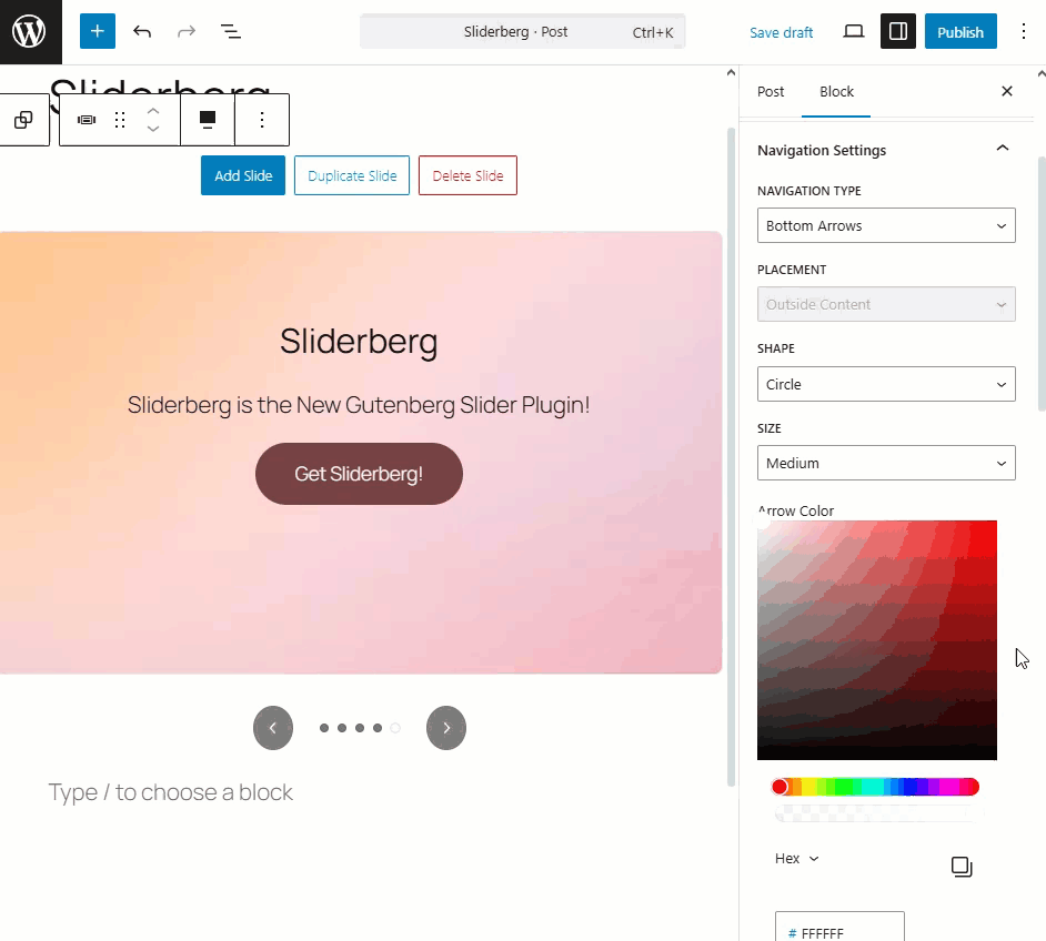
You can also change the Navigation Shape and Size.
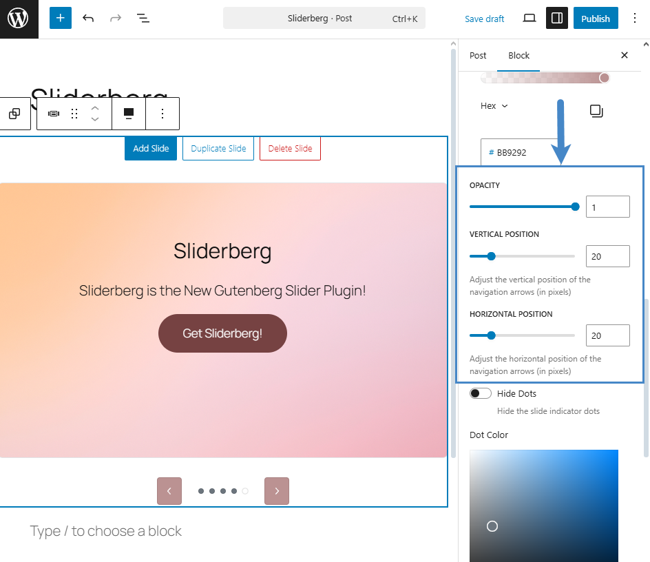
To change the arrow color, you can choose any color from the Arrow Color’s Color picker option. You can also input a specific color hex code if you like.

If you prefer, you can change the arrow’s background by selecting a new background color.

You can also define the arrow’s opacity, vertical position, and horizontal position.
After all the customizations are applied, you must save or publish your post or page.
Conclusion #
Navigation arrows do more than move slides—they’re visual cues that guide interaction. Sliderberg gives you complete control over their design and placement so you can make them blend in or stand out, depending on your layout goals.


