Sliderberg lets you control how your slider looks on different screen sizes with responsive breakpoints. You can adjust settings for desktop, tablet, and mobile to keep your content clear and well-structured. This helps your slider stay smooth, readable, and user friendly on every device.
Step 1: Enable the Carousel Mode #
Select the entire Sliderberg block. Then, go to the settings tab.
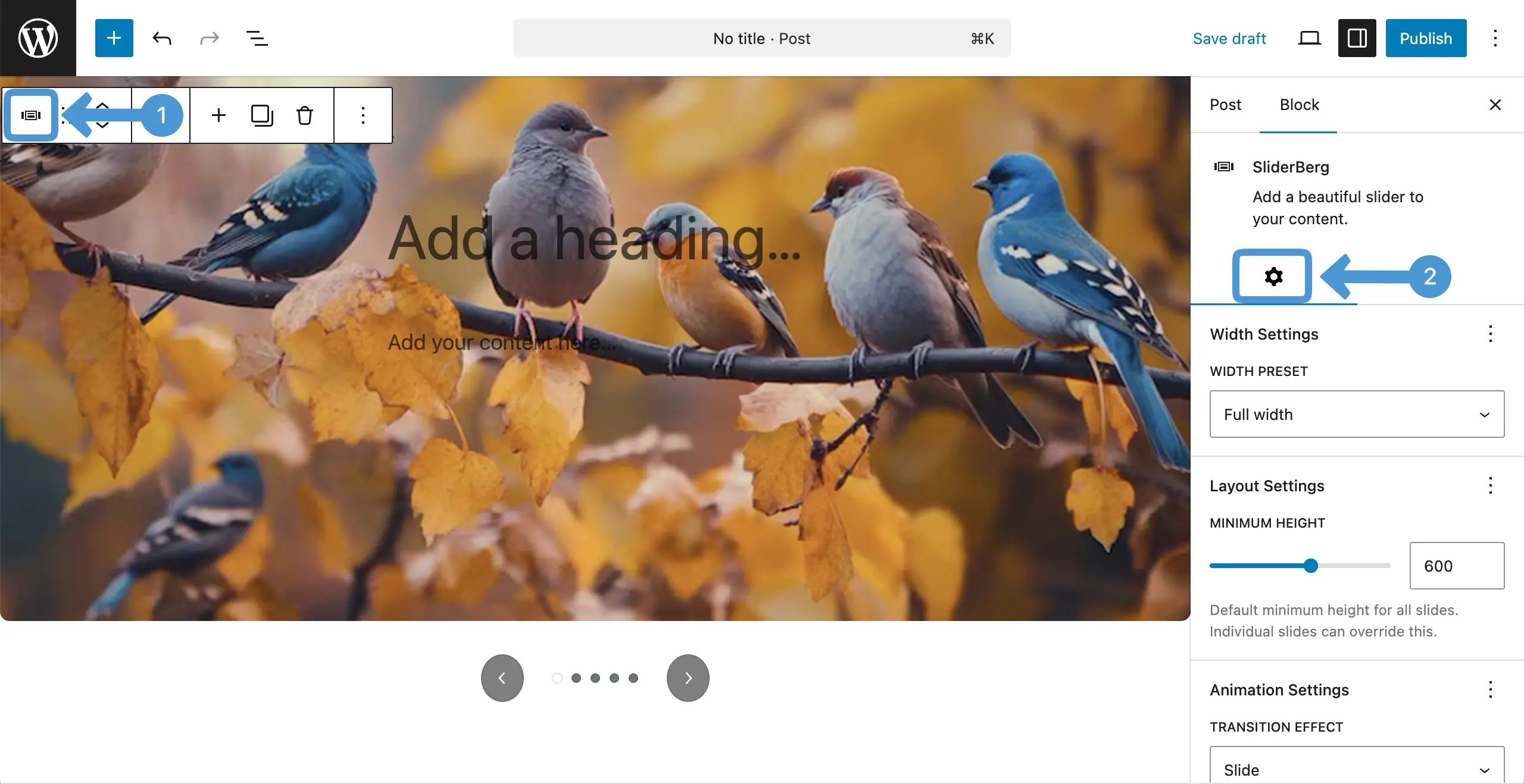
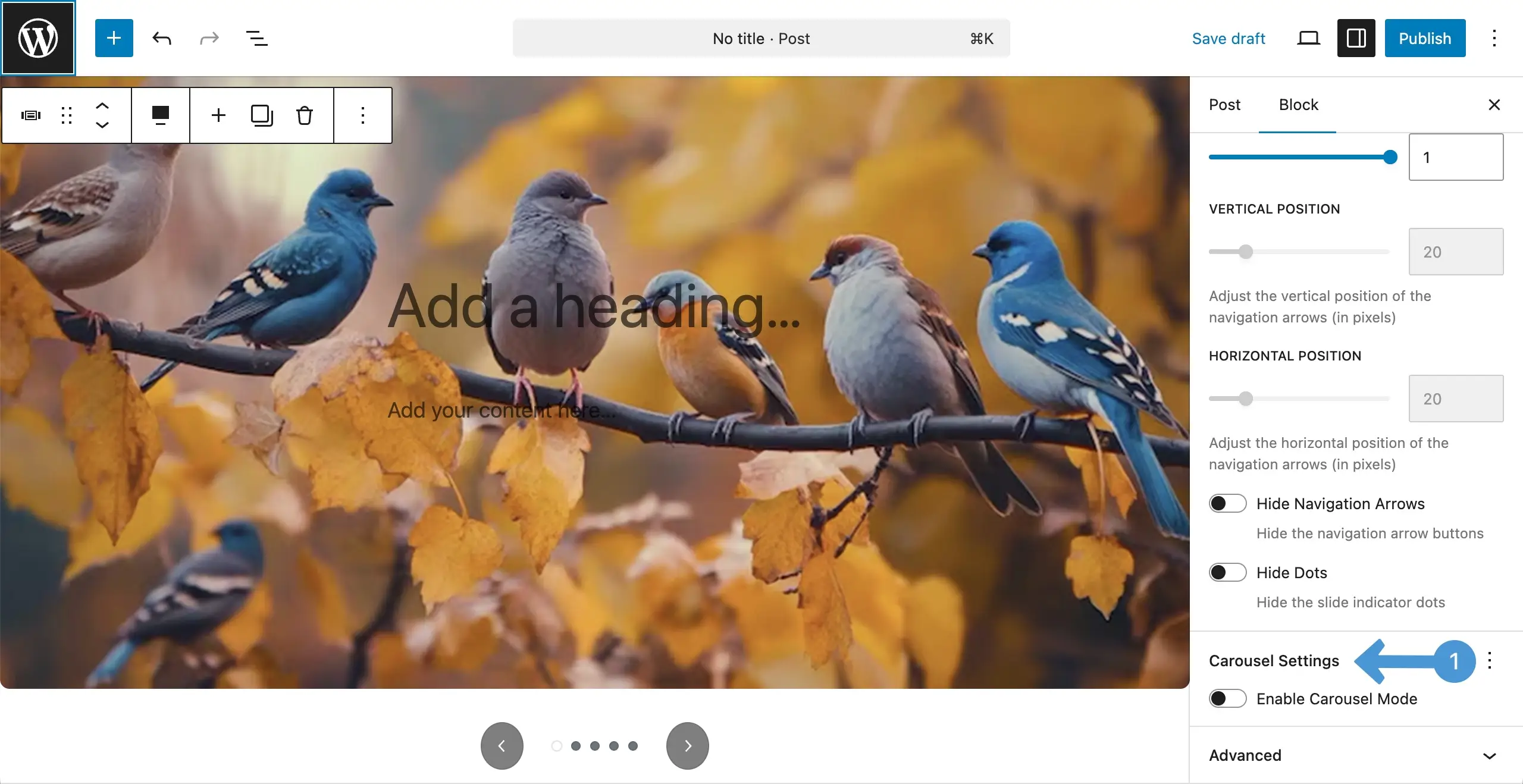
Scrolling down the settings tab, come to the carousel settings option. Activate the enable carouse mode by toggling it on.
Step 2: Set Breakpoints for Different Screen Sizes #
Once it’s enabled, you will get the option to switch between different screen sizes – Desktop, Tablet, and Mobile. You can set specific settings separately for each screen size.
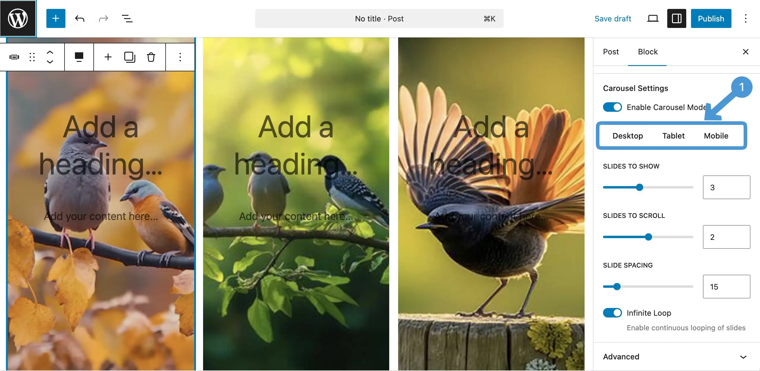
See the video clip attached below. You can switch between different screen sizes by clicking on the respective tabs and configure settings specifically for them.
Conclusion #
Set your breakpoints with care to match each screen size. Avoid showing too many slides on small devices and keep spacing clean. Always test on desktop, tablet, and mobile to ensure a smooth, balanced, and easy viewing experience for all users.


